
Sticky Add-to-Cart & Micro-UX: Small Patterns, Real Lift
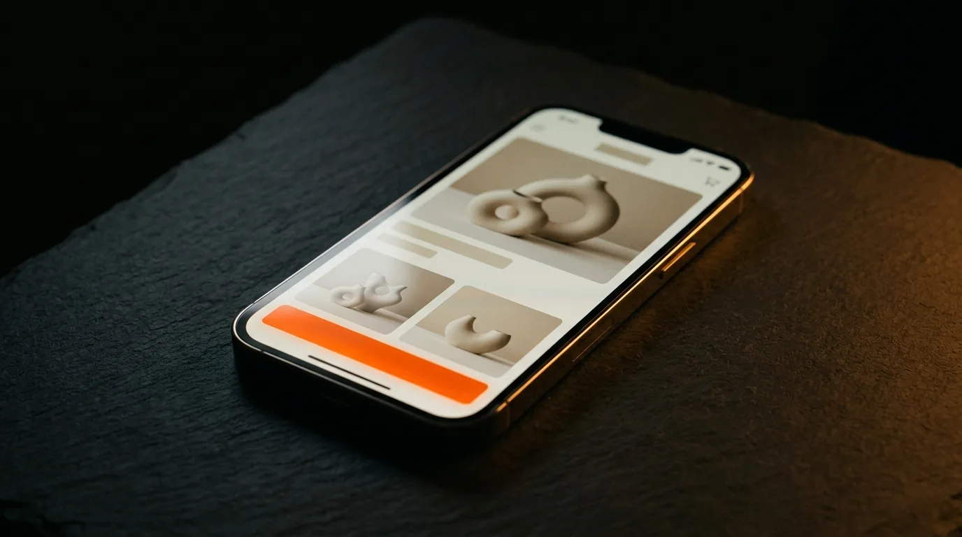
Small UX patterns quietly lift conversions, and the clearest example is the sticky add-to-cart: on a long mobile product page, the buy button scrolls off-screen right when the shopper decides — so keep it pinned and reachable. Stack that with a handful of other micro-UX details — instant add feedback, clear honest stock, easy quantity, an obvious COD option — and small frictions you were losing sales to disappear. None of these is dramatic on its own; together they add up.
Here are the patterns worth adding.
Start with sticky add-to-cart
Product pages are long, especially on mobile, and a buyer who decides two-thirds of the way down shouldn't have to scroll back up to buy. A sticky add-to-cart — pinned to the bottom of the screen — keeps the action available at the exact moment of intent. It's one of the highest-return micro-changes on a product page that converts, because it removes friction precisely where the decision happens.
Want us to find what’s leaking your sales?
Send us your store. We’ll record a 10-minute teardown of the exact spots costing you orders — free, no pitch.
The micro-UX details that add up
- Instant feedback on add. A clear "added to cart" confirmation reassures the buyer the action worked — silence creates doubt and repeat taps.
- Clear, honest stock status. "In stock" or a genuine low-stock note helps; fake scarcity breaks trust.
- Easy quantity and variants. Big, obvious controls — not fiddly dropdowns that fight a thumb.
- An obvious COD option. For a first-time cash-on-delivery buyer, seeing COD early removes a real hesitation.
- A visible mini-cart. So buyers can review and get to checkout in a tap.
Why the small stuff compounds
Each of these removes a tiny bit of friction or doubt at a specific step. One alone barely moves the number; together they smooth the whole path from first screen to checkout, which is where conversions actually live. It's the same logic as cart recovery — a lot of lost sales are friction, not lost interest, and friction is fixable.
Free: the Scroll-to-Sale Checklist
The 1-page checklist we run on every store before it goes live — 37 conversion checks, in plain language. No cost.
Download the checklist →Build for the thumb, not the mouse
Every micro-UX pattern should be judged on a real mid-range phone, because that's where most Pakistani shoppers are. Big tap targets, reachable buttons, fast feedback, minimal scrolling back and forth — the mobile experience is the experience. A pattern that helps on desktop but fights a thumb on mobile is a net loss.
The bottom line
Micro-UX is small patterns with real cumulative lift: a sticky add-to-cart so the buy button is always reachable, instant feedback, honest stock, easy quantity, an obvious COD option — all built for the thumb. Each is minor; together they recover sales you're quietly losing to friction. Want us to teardown your product page's UX and find the easy lifts? Send us your store.
Frequently asked questions
What is a sticky add-to-cart button?
It's an add-to-cart button that stays visible (usually pinned to the bottom of the screen) as the shopper scrolls down a long product page, so they can buy the moment they decide without scrolling back up. On long mobile product pages it removes a real point of friction and reliably helps conversions.
Does sticky add-to-cart actually increase sales?
It tends to, because it removes friction at the exact moment of intent — the buyer decides, and the button is right there. On mobile, where product pages are long and the button otherwise scrolls off-screen, keeping it reachable is a small change that recovers sales you'd otherwise lose to a scroll.
What is micro-UX?
Micro-UX is the set of small interaction details — a sticky buy button, instant "added to cart" feedback, clear stock status, easy quantity controls, an obvious COD option — that individually seem minor but together noticeably lift conversions. They reduce friction and doubt at each step, which compounds across a whole funnel.
Which micro-UX patterns matter most for a Pakistani store?
A sticky add-to-cart on mobile, an obvious and reassuring COD option, instant feedback when something's added, and clear honest stock status. These reduce the hesitation and friction that cause first-time COD buyers to drop off, and they cost little to implement relative to the lift.
Want us to find what’s leaking your sales?
Send us your store. We’ll record a 10-minute teardown of the exact spots costing you orders — free, no pitch.