The Anatomy of a Product Page That Converts (With Real Examples)
A product page converts when it answers three questions in the first three seconds — what is this, why is it better than the alternative, and can I trust you — and then systematically removes every reason not to buy. Everything else is detail. The pages that sell aren't the prettiest; they're the ones engineered around the buyer's decision instead of the theme's default layout.
Below are the nine building blocks we put on every product page we build, in the order the buyer needs them. Open the live examples as you read — they're real stores, not mockups.
1. Above the fold: win the first screen
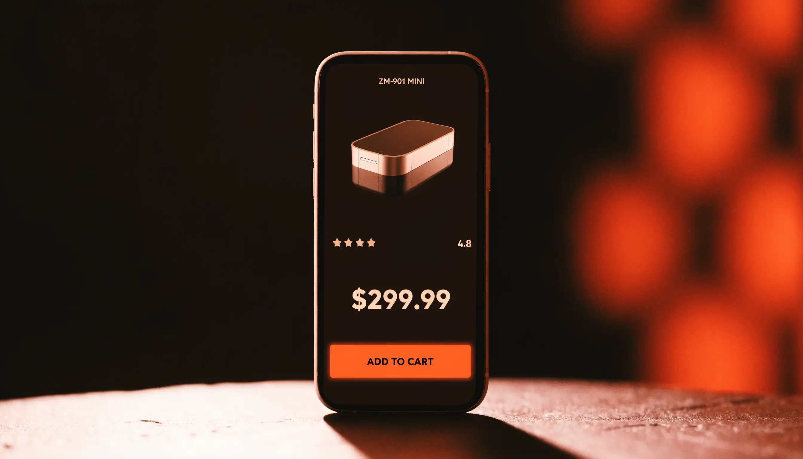
The first screen decides whether they stay. It needs the product name, a one-line benefit (not a feature), the price, the star rating, and the buy button — all visible without scrolling. If a stranger can't tell what you sell and why it's worth it in three seconds, nothing below matters.
Look at how this niche fragrance product page sets the scene above the fold versus a generic theme — the difference is deliberate hierarchy, not decoration.
2. A gallery that sells
Your images are your salesperson on mobile. You need at least 5–7: a clean hero, the product in use, a size/scale reference, a detail or ingredient shot, and one image that directly answers the biggest objection (texture, before/after, packaging). Real surface, real light, real shadow — never a product floating on plain white.
Want us to find what’s leaking your sales?
Send us your store. We’ll record a 10-minute teardown of the exact spots costing you orders — free, no pitch.
3. Benefit-led copy, not spec dumps
Buyers don't want features; they want the outcome. "50ml, long-lasting" is a spec. "One spray in the morning, still there when you get home" is a benefit. Lead with what changes in their life, then back it with the spec for the skeptics.
4. Trust signals, placed where doubt appears
Pakistani buyers need a reason to believe before they pay — especially on COD. Put trust exactly where hesitation happens: a guarantee near the price, delivery and return info near the button, secure-checkout and COD badges at the cart. See how this supplement product page stacks trust around the buying decision.
5. Social proof that feels real
Reviews, ratings, UGC, "X sold this month." Real and specific beats polished and generic every time. A screenshot of a real WhatsApp message often converts better than a five-star widget, because it looks like something a person actually sent.
6. Objection handling
Every product has three or four reasons people don't buy: too expensive, won't work for me, don't trust the brand, delivery worry. Name them and answer them on the page — in the copy, in an FAQ, in a comparison. An unanswered objection is a silent "no."
Free: the Scroll-to-Sale Checklist
The 1-page checklist we run on every store before it goes live — 37 conversion checks, in plain language. No cost.
Download the checklist →7. A sticky, obvious call-to-action
One primary action, repeated. Above the fold, and again as a sticky add-to-cart bar that follows the buyer on mobile. Don't make anyone scroll back up to buy the moment they've decided.
8. Bundles and upsells that lift AOV
Once someone's decided to buy, a well-placed bundle ("buy 2, save 15%") or a relevant add-on raises your average order value without a single extra ad rupee. This is the cheapest revenue in your funnel — and where the Meta ad math starts to work in your favour, because a higher AOV means you can pay more to acquire a customer.
9. Speed and mobile-first everything
Most of your buyers arrive from a Reel on a mid-range Android. If the page is slow or clumsy on mobile, you lost them before element one. Compress images, lazy-load, and test on the phones your customers actually use — not your laptop.
The page in the order a buyer's brain works
A converting page follows the buyer's decision, not a theme's layout. The order that works:
- Hook — name, one-line benefit, price, rating, buy button (above the fold).
- Proof it's real — the gallery, in use.
- Why it's better — benefit-led copy.
- Why trust you — guarantees, delivery, COD badges.
- What others say — reviews and UGC.
- Answer the doubts — objections and FAQ.
- Make it easy — sticky cart, bundles.
Each block exists to move someone one step closer to "add to cart." If a section doesn't do that, cut it.
Writing copy that closes: the PDP formula
Weak product copy lists features. Strong copy does three jobs in order: name the problem the buyer feels, paint the outcome they want, then hand them the proof. "50ml, long-lasting" is a spec. "One spray in the morning, still there when you get home — so you stop reapplying at lunch" is a sale.
Write to one person, in the words they'd actually use. For Pakistani audiences, a line of Roman Urdu often lands harder than polished English: "Ek baar laga ke dekhein — farq khud pata chal jayega." Match the language to how your buyer really talks, not how a brochure sounds.
Trust in a cash-on-delivery market
COD buyers pay a stranger for something they haven't held. They need reasons to believe before they order, not after. Put trust exactly where the doubt is: a guarantee beside the price, clear return and delivery terms beside the button, and real proof (screenshots, ratings, "X sold this week") through the page. A visible WhatsApp number does quiet heavy lifting — the option to ask a human before paying removes the last hesitation.
A 60-second teardown you can run tonight
Open your own product page and ask five questions in order:
- Can I tell what this is and why it's better in 3 seconds?
- Do the images show it in real use, not floating on white?
- Is there a reason to trust the brand before I pay?
- Are my top two objections answered on the page?
- Is the buy button one tap away right now, on mobile?
Most Pakistani store pages fail two or three of these — and every failure is orders walking away. The gaps you find are your fastest wins.
If you only change one thing this week
Fix the first screen. It decides whether anyone reads the rest. Get the name, one-line benefit, price, rating and buy button visible without scrolling — tested on a mid-range Android, not your laptop. It's the highest-leverage change on the page, and most stores get it wrong.
Put it together
A converting product page isn't a list of parts — it's a sequence that mirrors how a buyer decides. Nail the above-the-fold, prove the value, remove the doubt, and make buying one tap away.
If you want a second pair of eyes on where your own page leaks sales, that's literally our free store teardown — we record a 10-minute walkthrough of the exact spots costing you orders. You can see the stores we've built first, then send us yours.
Frequently asked questions
What makes a product page convert?
A converting product page answers three questions in seconds — what is this, why is it better, and can I trust you — then removes every reason not to buy. In practice that means a strong above-the-fold, benefit-led copy, real trust signals, social proof, clear pricing, and one obvious call-to-action that follows the buyer down the page.
How long should a product page be?
As long as it takes to answer every objection, and not a word more. A low-price impulse product might convert on one screen; a PKR 8,000 supplement needs ingredients, proof, guarantees and FAQs. Let the price and the skepticism decide the length.
Where should the "Add to Cart" button go?
Above the fold on the first screen, and again as a sticky bar that follows the buyer on mobile. Most Pakistani buyers shop on mid-range Android phones — if they have to scroll back up to buy, you've added friction exactly when they're ready.
How many product images do I need?
At least 5–7: a clean hero, the product in use, a scale or size reference, an ingredient or detail shot, and one that answers the biggest objection. On mobile the gallery is your salesperson — thin galleries lose sales.
Want us to find what’s leaking your sales?
Send us your store. We’ll record a 10-minute teardown of the exact spots costing you orders — free, no pitch.