
The Premium Look on a Startup Budget: Branding That Punches Up
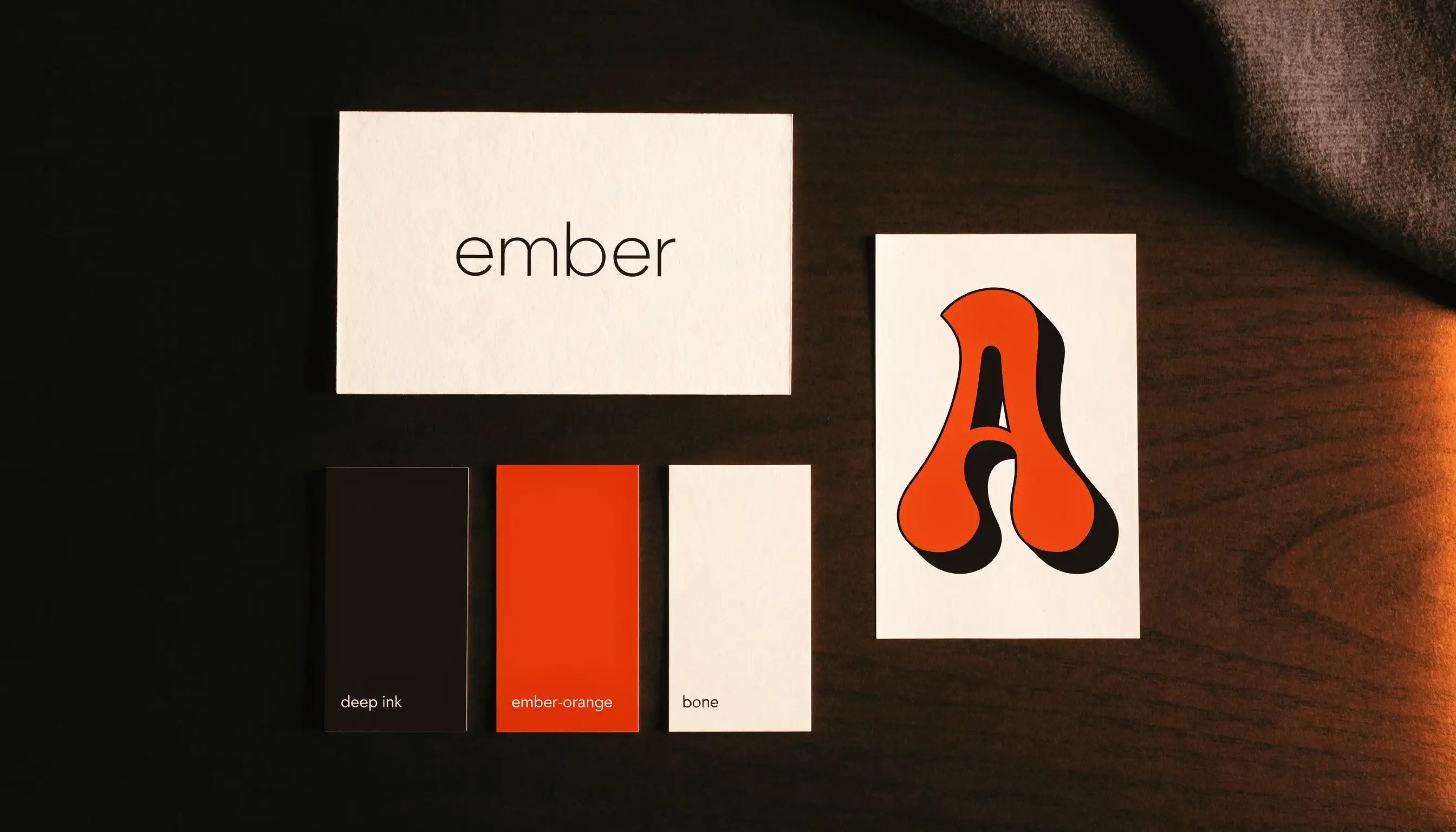
You make a brand look premium on a small budget by doing a few things with discipline — a restrained palette, one or two good fonts, generous spacing, and real photography with proper light and shadow — instead of doing many things cheaply. Premium isn't a budget; it's restraint and consistency. Cheap-looking brands cram in too much. Expensive-looking brands leave things out. Here's exactly where to focus when you have almost nothing to spend.
Premium is subtraction, not addition
The instinct on a tight budget is to add — more colours, more fonts, more effects, more badges — to feel like you're getting value. It backfires. Every extra element makes a brand look busier and cheaper. The most premium brands you can think of use one or two colours, one or two fonts, and a lot of empty space. Restraint reads as confidence, and confidence reads as premium.
So before you spend a rupee, subtract. Fewer, cleaner, more consistent beats more.
The five details buyers actually judge
You don't need a full brand system. You need these five right:
- Typography. One display font with personality, one clean font for body. Consistent everywhere. Fonts are half your premium feel and cost nothing (great free fonts exist).
- A tight colour palette. One dominant colour, one accent, one or two neutrals. That's it. More colours = more amateur.
- Space. Generous margins and breathing room. Crowding is the fastest way to look cheap; space is free.
- Real photography. Product on a real surface, directional light, a cast shadow — never floating on plain white. This one detail separates premium from marketplace.
- A confident voice. Short, sharp, benefit-led copy. No hedging, no fluff. Voice costs nothing and instantly signals a real brand.
Not sure what your brand needs first?
Tell us where you are. We’ll show you the shortest path to more orders — store, ads or brand — with no obligation.
Where to spend vs where to save
With limited money, put it where the buyer's eye lands hardest:
Spend on:
- Your logo/wordmark — you'll use it everywhere; getting it slightly wrong is expensive.
- Your product page — where the sale is actually won, so build it to convert.
- Product photography — the single biggest "cheap vs premium" lever for an online brand.
Save on (for now):
- Business cards, letterheads, elaborate brand guideline documents.
- Secondary logos, mascots, and sub-brands you don't need yet.
- Anything customers never actually see.
Spend where it converts; skip what only feels productive.
Free: the Scroll-to-Sale Checklist
The 1-page checklist we run on every store before it goes live — 37 conversion checks, in plain language. No cost.
Download the checklist →The photography shortcut
You don't need a studio. A phone, a window for soft directional light, a real surface (wood, stone, fabric), and attention to shadow will beat most "on-white" catalogue shots. Real surface + real light + real shadow is the honest, premium look — and it's basically free. If you take one thing from this post, make it this.
Consistency is the multiplier
The cheapest way to look expensive is to be relentlessly consistent. Same font, same palette, same voice, same photo style — across your store, your ads, your packaging and your feed. A modest brand applied consistently looks more premium than an ambitious brand applied randomly. Consistency is what makes the whole thing feel intentional, and intentional feels premium.
When to bring in help
Discipline gets a startup surprisingly far. But the logo and the store are where getting it slightly wrong quietly costs you sales — and where a professional pays for itself. If you're not sure whether you need one yet, our honest guide to choosing an ecommerce agency covers exactly that. And if you want to see what disciplined, premium-on-purpose branding looks like in practice, browse the stores we've built — then tell us about your brand and we'll show you where to focus first.
Frequently asked questions
How can a small brand look premium without a big budget?
Focus your limited budget on the few things buyers actually judge quality by: consistent typography, a restrained colour palette, generous spacing, real photography with proper light and shadow, and a confident brand voice. "Premium" is mostly discipline and consistency, not expensive assets. Doing a few things cleanly beats doing many things cheaply.
What makes a brand look expensive?
Restraint and consistency. Expensive-looking brands use fewer colours, one or two well-chosen fonts, lots of breathing room, and photography with real surfaces, directional light and shadow. Cheap-looking brands cram in too many colours, fonts and effects. Simplicity, space and consistency read as premium; clutter reads as cheap.
Where should I spend vs save on branding as a startup?
Spend on the things customers see most and judge hardest: your logo/wordmark, your product page, and your product photography. Save on things nobody sees or that can wait — business cards, elaborate brand guidelines, secondary sub-logos. Put money where the buyer's eye actually lands.
Do I need a professional designer to look premium?
Not necessarily to start — disciplined use of good fonts, a tight palette and clean photography goes a long way. But a professional makes the biggest difference on the logo and the store, where getting it slightly wrong costs you sales. Start disciplined, invest professionally where it converts.
Not sure what your brand needs first?
Tell us where you are. We’ll show you the shortest path to more orders — store, ads or brand — with no obligation.