Logo vs Brand Identity: What You're Actually Paying For
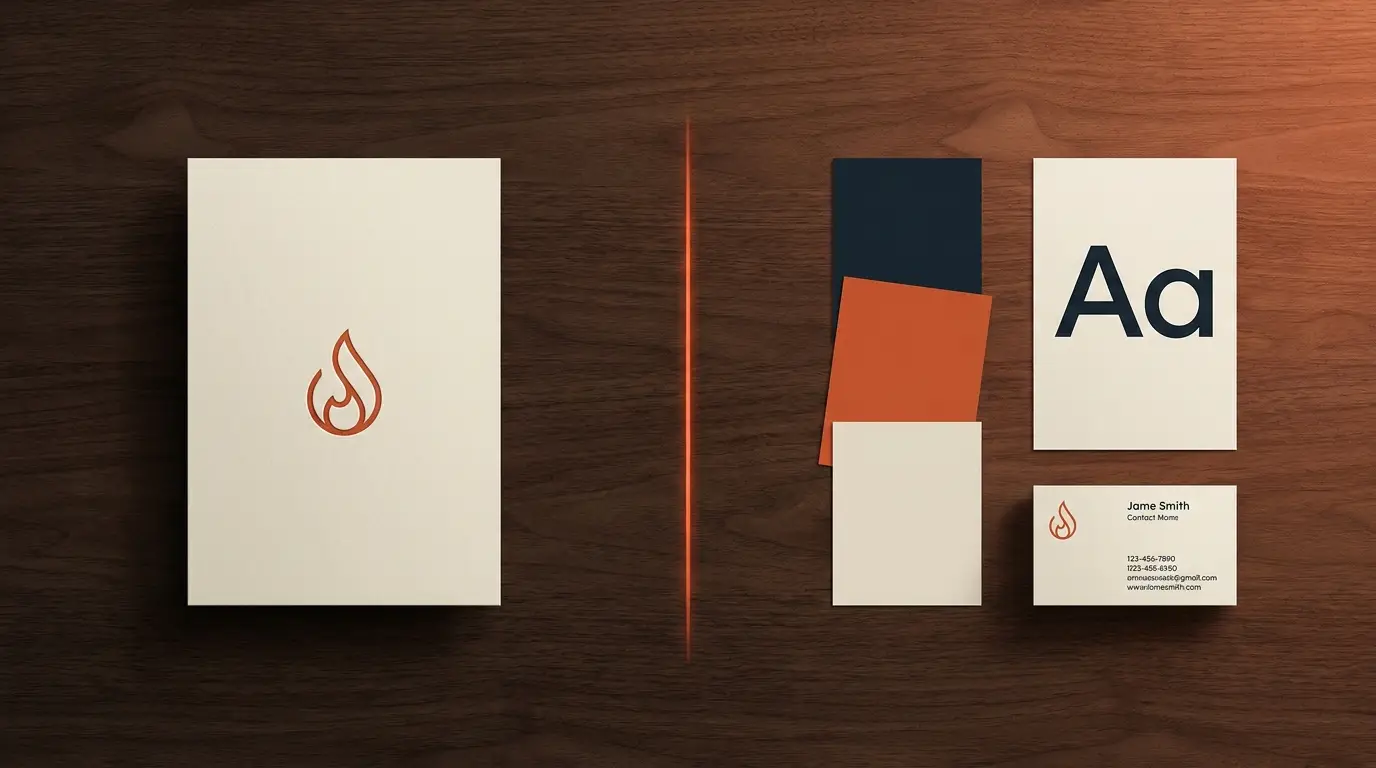
A logo is a single mark; a brand identity is the entire system around it — colours, typography, imagery style, layout and voice — that makes everything you touch look and sound like one coherent brand. The logo is one ingredient. The identity is the recipe. Confusing the two is why plenty of businesses buy a nice logo and still look cheap and inconsistent everywhere else. Here's exactly what you're paying for.
The simplest way to see the difference
Your logo is the mark — the symbol or wordmark people recognise. Important, but it's one piece.
Your brand identity is everything that makes your brand feel like itself across every touchpoint: the colours, the fonts, the way photos are shot, the spacing and layout, the tone of your words. It's the system that makes your store, your ads, your packaging and your Instagram all obviously belong to the same brand.
A logo answers "what's your mark?" An identity answers "what does your whole brand look and sound like, everywhere?"
Why a logo alone leaves you looking cheap
Here's what happens with just a logo and no system: your store uses one set of colours, your ads use another, your packaging a third, your captions a fourth voice. Even with a great logo, the whole thing feels mismatched and amateur — because nothing ties it together.
The premium feeling comes from consistency, and consistency comes from the identity system, not the logo. That's the piece most first-time founders underinvest in. (More on getting there cheaply in our guide to the premium look on a startup budget.)
Not sure what your brand needs first?
Tell us where you are. We’ll show you the shortest path to more orders — store, ads or brand — with no obligation.
What a real brand identity includes
At minimum, a usable identity gives you:
- Logo — the mark, in its usable variations.
- Colour palette — one dominant, one accent, a couple of neutrals. Used the same everywhere.
- Typography — a display font with personality and a clean body font.
- Imagery style — how your photos look (surface, light, mood) so they feel like one brand.
- Brand voice — how you sound, in words, consistently.
Bigger systems add layout rules, iconography, packaging guidelines and usage do's and don'ts. But for a startup, applying those five things consistently matters more than a thick brand book nobody follows.
Free: the Scroll-to-Sale Checklist
The 1-page checklist we run on every store before it goes live — 37 conversion checks, in plain language. No cost.
Download the checklist →So what should you buy?
If you're starting out on a tight budget, you don't need a 60-page brand book — but you do need more than a logo. Get the essentials right and apply them relentlessly: one palette, two fonts, a consistent photo style, a clear voice. That's a real identity, even a lean one, and it'll make you look like a brand instead of a seller.
And if you're not sure whether you need a full identity project or just the essentials, our honest guide to choosing an agency covers when to invest and when to keep it simple.
The bottom line
Don't buy a logo and expect a brand. A logo is the mark; the identity is the system that makes everything feel intentional, consistent and premium — and that system is what actually earns trust and price. If you want an identity built to make your store and ads look like the obvious premium choice, tell us about your brand and we'll show you where to focus first.
Frequently asked questions
What is the difference between a logo and a brand identity?
A logo is a single mark — one symbol or wordmark. A brand identity is the complete visual and verbal system around it: colours, typography, imagery style, layout rules, voice and how it all works together. The logo is one ingredient; the identity is the recipe that makes everything look consistently like your brand.
Is a logo enough for a small business?
A logo alone is rarely enough to look premium or consistent. Without a colour palette, fonts, imagery style and voice, your store, ads and packaging end up looking mismatched even with a nice logo. A basic identity system — even a small one — is what makes a brand feel intentional.
What should a brand identity include?
At minimum: a logo, a colour palette, typography (a display and a body font), an imagery/photography style, and a brand voice. Larger systems add layout rules, iconography, packaging guidelines and usage do's and don'ts. For a startup, nailing palette, type, imagery and voice consistently matters more than a thick guideline document.
Why does brand identity cost more than a logo?
Because you're paying for a system, not a picture. A logo is one deliverable; an identity is the strategy and set of rules that make every touchpoint — store, ads, packaging, social — look and sound like one coherent brand. That consistency is what commands trust and a premium price, which is why it's worth more.
Not sure what your brand needs first?
Tell us where you are. We’ll show you the shortest path to more orders — store, ads or brand — with no obligation.