Hero Section Formulas: 7 Above-the-Fold Layouts That Convert
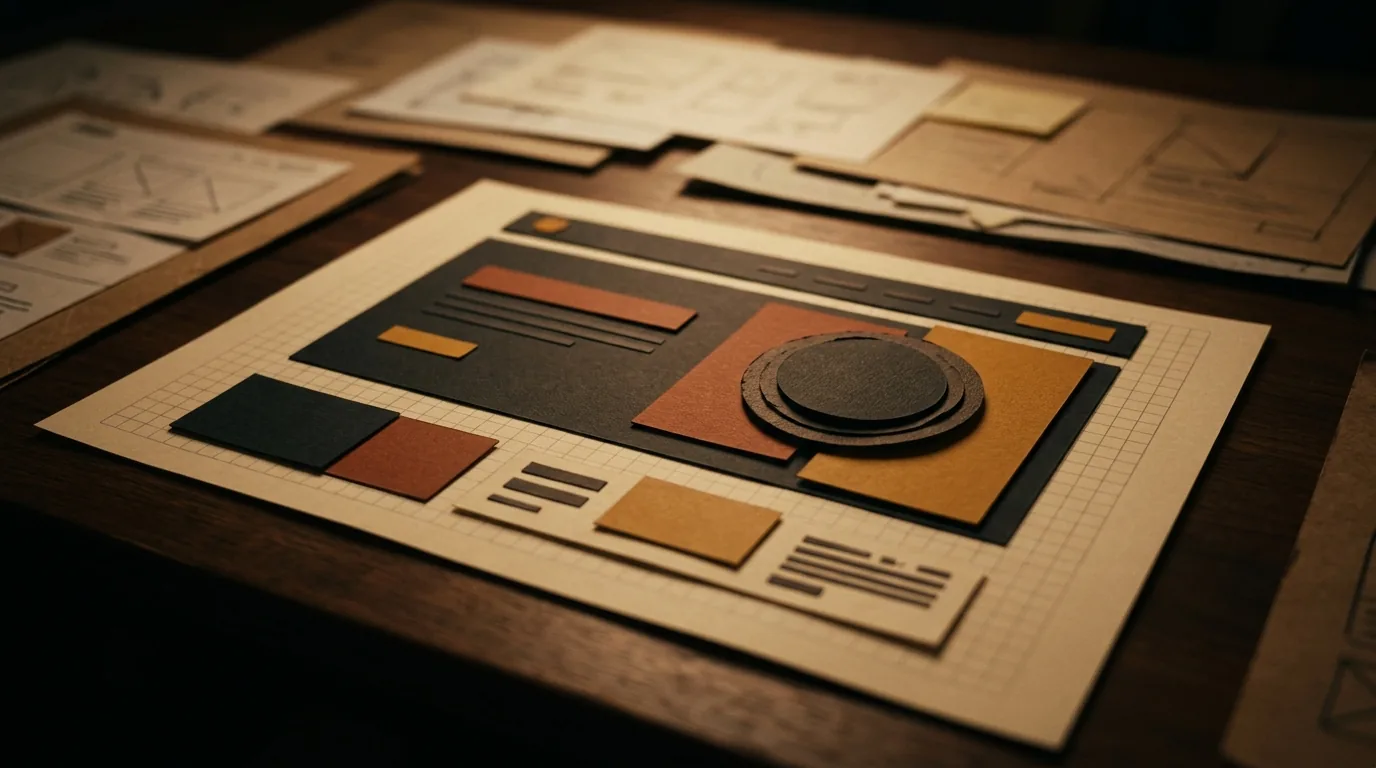
Your hero section — the first screen above the fold — gets about three seconds to earn the scroll, and it heavily decides whether visitors stay or leave. Whatever the layout, it must do four things: state a clear value proposition, give one obvious primary action, show a trust cue, and lead with a strong visual. Below are seven layouts that convert, each leading with a different strength — pick the one that leads with your single strongest reason to buy. Clarity beats cleverness; the hero that says one thing well wins.
Here are the seven formulas.
The four non-negotiables first
Before the layout, get the essentials right: a headline that states the core benefit, one primary CTA (not five), a trust cue, and a strong visual. Every layout below is just a different way to arrange these — and none of them rescue a hero that's missing them. This is the tip of the same iceberg as a product page that converts: the first screen sells the scroll, the rest sells the product.
Want us to find what’s leaking your sales?
Send us your store. We’ll record a 10-minute teardown of the exact spots costing you orders — free, no pitch.
The 7 layouts
- Product-forward hero — the product big and hero-lit with a benefit headline. Best for visually strong products that sell themselves.
- Lifestyle image + overlay CTA — an aspirational scene with headline and button on top. Best for emotional or lifestyle products.
- Split layout — image on one side, copy and CTA on the other. Clean, balanced, works for almost anything.
- Benefit-led text hero — a bold benefit statement leads, product sits just below. Best when the promise sells harder than the look.
- Social-proof-forward — a rating, review, or "trusted by" cue right at the top. Best for trust-sensitive categories like supplements or skincare.
- Offer hero — the deal is the headline. Best during a sale season or when a strong offer is your edge.
- Video / UGC hero — a short authentic clip carries the first impression. Best when UGC is central to how you sell.
How to choose yours
Don't pick by taste — pick by what sells your product hardest. Lead with your single strongest reason to buy: the look, the promise, the proof, or the deal. The deeper principle of what earns attention in that first screen is covered in above-the-fold design; these seven are the practical shapes it takes. Your typography and color choices then decide whether the chosen layout feels premium or cheap.
Free: the Scroll-to-Sale Checklist
The 1-page checklist we run on every store before it goes live — 37 conversion checks, in plain language. No cost.
Download the checklist →Test, don't guess
The "right" hero is the one that performs for your store, so treat these as starting points and let real behaviour decide — while judging changes against realistic conversion benchmarks rather than a single day's numbers. Big, obvious hero changes are exactly the kind worth testing even on modest traffic.
The bottom line
The hero section earns or loses the scroll in seconds, so nail the four essentials — clear value prop, one CTA, a trust cue, a strong visual — then choose the layout that leads with your strongest reason to buy, from product-forward to offer to UGC. Improve the hero and you improve the outcome for every visitor who lands. Want us to teardown your hero section and homepage? Send us your store.
Frequently asked questions
What makes a hero section convert?
A clear value proposition, one obvious primary action, a trust cue, and a strong visual — all working in the first screen. The hero has seconds to tell people what you sell, why it's worth it, and what to do next. Layout choices matter, but they all serve those four essentials; clarity beats cleverness every time.
What should go in a hero section?
A headline that states the core benefit, a supporting line, one primary call to action, a strong product or lifestyle visual, and a trust cue (a rating, a guarantee, social proof). Everything else can wait below the fold. If the hero tries to say everything, it says nothing — keep it to the essentials that drive the next click.
How do I choose the right hero layout?
Match it to what sells your product. A visual product wins with a product-forward hero; an emotional or lifestyle product suits an image-led layout; a trust-sensitive category benefits from social-proof up top; a strong deal calls for an offer hero. Pick the layout that leads with your single strongest reason to buy.
Is the hero section really that important?
Yes — it's the first thing visitors see and it heavily influences whether they stay or leave. A weak hero loses people before they ever see your product range or offers. Because it affects everyone who lands, improving the hero is one of the highest-leverage changes you can make to a store.
Want us to find what’s leaking your sales?
Send us your store. We’ll record a 10-minute teardown of the exact spots costing you orders — free, no pitch.