Above the Fold: What the First Screen of Your Store Must Do
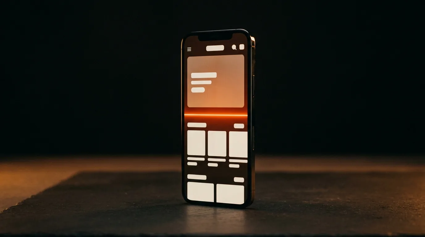
A visitor decides whether to stay on your store in about three seconds, and that decision happens above the fold — the first screen before scrolling. So that screen has one job: instantly answer what you sell, why you can be trusted, and what to do next. Miss any of those three and most of your paid traffic bounces before it ever sees your best work. Everything below the fold only matters if the top earns the scroll.
Most Pakistani stores waste the fold on a giant auto-sliding banner and a vague tagline. The stores that convert treat the first screen like a headline — it does the heavy lifting.
The 3-second test
Pull up your store on a phone, glance for three seconds, look away. Could a stranger say what you sell, to whom, and why it's better? If not, your fold is failing. Buyers don't study a page; they pattern-match it in a blink and decide whether it's worth their attention. The fold has to win that blink.
Want us to find what’s leaking your sales?
Send us your store. We’ll record a 10-minute teardown of the exact spots costing you orders — free, no pitch.
What the first screen must contain
Four things, in priority order:
- A clear value proposition. One line that says what you sell and why it's worth it — not a clever slogan nobody can decode. Clarity beats cleverness every time.
- The product (or the offer). Show the hero product or the deal immediately. A product shot that sells beats a lifestyle image that hides what you actually offer.
- A trust cue. A rating, a guarantee, "COD available", a recognisable delivery signal — one visible reason to believe you. Trust signals belong at the top, not buried.
- One primary action. A single obvious button — Shop, Buy, See the offer. One CTA, not five competing ones.
The fold is tiny on mobile — design for that
Most Pakistani store traffic is on a mid-range phone, and the mobile fold is small. That real estate is your most valuable space on the whole site. Don't spend it on a fat header, a cookie bar, and a newsletter popup that together bury the product below the crease. Test on an actual phone, not a desktop window shrunk down.
Free: the Scroll-to-Sale Checklist
The 1-page checklist we run on every store before it goes live — 37 conversion checks, in plain language. No cost.
Download the checklist →The mistakes that kill the fold
- Auto-rotating sliders — they dilute the message and most users never see slide two. Pick one message and commit.
- Vague hero copy — "Elevate your everyday" tells no one anything. Say what it is.
- Popups on arrival — an offer popup before the visitor has seen a single product is a bounce machine.
- Slow load — if the fold takes seconds to paint, the visitor's gone before it arrives. Page speed is a conversion feature.
- No trust anywhere — a cold first screen makes a first-time COD buyer hesitate.
The bottom line
Your above-the-fold has three seconds to say what you sell, why to trust you, and what to do next — with one clear product, one trust cue, and one CTA, fast-loading and built for the mobile crease. Fix the top and the whole funnel lifts, because more people actually reach it. Everything under the fold — your checkout and cart recovery included — only pays off if the first screen earns the scroll. Want us to teardown your store's first screen and show exactly what's costing you the bounce? Send us your store.
Frequently asked questions
What does "above the fold" mean for an online store?
It's everything a visitor sees on the first screen before scrolling. On a store it's the most valuable space you have, because visitors decide in about three seconds whether to stay. It must instantly show what you sell, a reason to trust you, and one clear next action.
What should be above the fold on an ecommerce homepage?
A clear one-line value proposition, the hero product or offer shown immediately, one visible trust cue (rating, guarantee, COD available), and a single primary call to action. Keep it to one message and one button — competing sliders and multiple CTAs dilute the decision.
Does above-the-fold still matter on mobile?
More than ever. Most Pakistani store traffic is on mobile, where the fold is small, so that space is your highest-value real estate. A bloated header, cookie bar, and arrival popup can bury your product below the crease — always test the first screen on a real phone.
Should I use a homepage slider?
Usually no. Auto-rotating sliders split your message and most visitors never see the second slide, so they tend to lower clarity and conversions. Pick your single strongest message or offer and commit the fold to it instead.
Want us to find what’s leaking your sales?
Send us your store. We’ll record a 10-minute teardown of the exact spots costing you orders — free, no pitch.